contact
Office of Communications and Public Affairs
School of Dentistry Student Branding Guidelines
The University of Maryland, Baltimore’s (UMB) student branding toolkit is designed to guide students on how to appropriately represent the UMB brand across various platforms and contexts. This toolkit provides comprehensive guidelines on the use of the University’s logos, colors, fonts, and messaging to ensure consistency and professionalism. By adhering to these standards, students can effectively convey the values, reputation, and identity of UMB, enhancing both their personal brand and the institution’s public image.
Once you have completed your design, please send it to the Office of Communications for approval at hselby@umaryland.edu.
Name
- University of Maryland School of Dentistry or UM School of Dentistry can be used.
- Terms like “Maryland Dental,” “UMB Dental,” or “Maryland Dental School” may not be used.
- The School of Dentistry logo does not need to be used, but when it is used, it must fall within the brand standard guidelines. Also, no distortion of the logo is allowed.
- If University of Maryland, Baltimore is spelled out on one line, make sure there is a comma between Maryland and Baltimore, because the comma being omitted has been a common issue.
- The official university seal may not be used.
- Any artwork that is created needs to be separate from the university name (regardless of whether it is the official logo or the name spelled out in one of the approved fonts listed below).
- The UMB trademarked columns, or “Davidge mark,” may not be used outside of the official logo
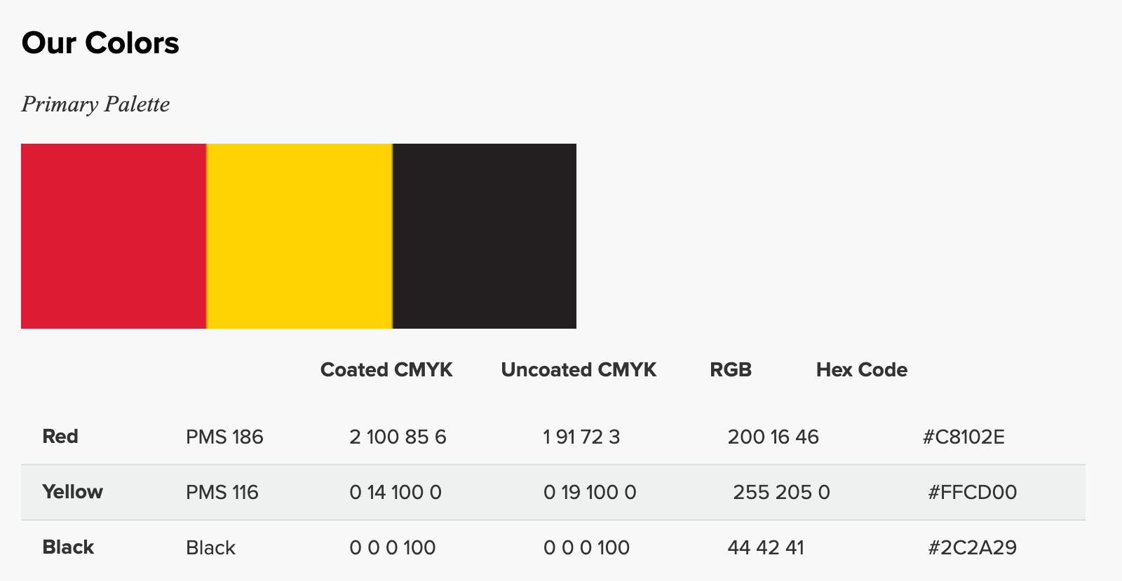
Colors

Fonts
The approved fonts are Aptos, Arial, Calibri, and Times New Roman. A collegiate-style font may be used as well. You can use these fonts to spell out the university name for larger items such as shirts and tote bags. When doing this, the name cannot look like its own logo (no stylized text or graphics can be incorporated into or next to the name).
They can be found by searching for fonts with bold, strong, or classic serif designs. If you’re looking for specific collegiate-style fonts, you might need to download them from external font websites and install them onto your system.
The images shown below are examples of collegiate-style fonts:

Appropriate Logo Use

Spacing: Using the ‘U’ as a Guide

When placing the University of Maryland, Baltimore logo or any school logo next to copy or other graphics, please use the recommended safety zone around the perimeter of the logo. The safety zone is based on the height of the “U” in the word University. The distance should be spaced from the lowest point of the logo, meaning don’t measure from the middle or top of the logo; measure the distance from the lowest point to ensure that there is consistency in spacing.
Please make sure that the columns are not distorted because they represent an official logo and must be preserved in their original form.
Spacing: When Not Using the Official Logo
If using a different font for the university name, there needs to be at least a half-inch of space around it on all sides.
Here is an example of approved spacing:

Maryland Flag Tooth
If using a tooth with the Maryland flag, the Office of Communications and Public Affairs has provided the School of Dentistry with two options to use. No other versions of the Maryland flag in a tooth are permitted.

Other Information
Any questions can be directed to branding@umaryland.edu. The University’s full Brand Style Guide can be found at umaryland.edu/cpa/branding.


